After 60, the colors you choose can have a noticeable impact on how polished and sophisticated your winter outfits appear. While style should never be limited by age, certain coat colors tend to highlight fabric flaws, wash out mature skin tones, or create a dated or inexpensive effect even when the coat itself is well-made. Understanding which shades can unintentionally cheapen your look and knowing which alternatives offer effortless elegance increases the versatility of your wardrobe and helps you present the refined, confident image you want all season long.
Table of Contents
1. Neon Shades
Neon colors like highlighter yellow, electric pink, lime green, or bold neon orange tend to overpower rather than enhance your overall appearance. These hyper-bright tones rarely translate well in winter fabrics such as wool blends, puffers, or faux furs, because the intensity of the color emphasizes synthetic textures and makes even high-quality materials appear inexpensive. Neons can also cast unflattering light on the face, creating harsh contrasts that accentuate lines and shadows.
2. Fire-Engine Red
Bright, primary red is striking, but it comes with drawbacks that become more noticeable in winter outerwear. This shade tends to highlight imperfections in fabric such as pilling, creasing, and inconsistent texture and can exaggerate undertones that make the coat appear lower quality. The intensity of the color may also compete with mature skin tones rather than complement them, creating a harsh or overly bold look. Additionally, fire-engine red often skews more youthful or trendy, which can make a coat feel dated quickly.
3. Baby Pastels
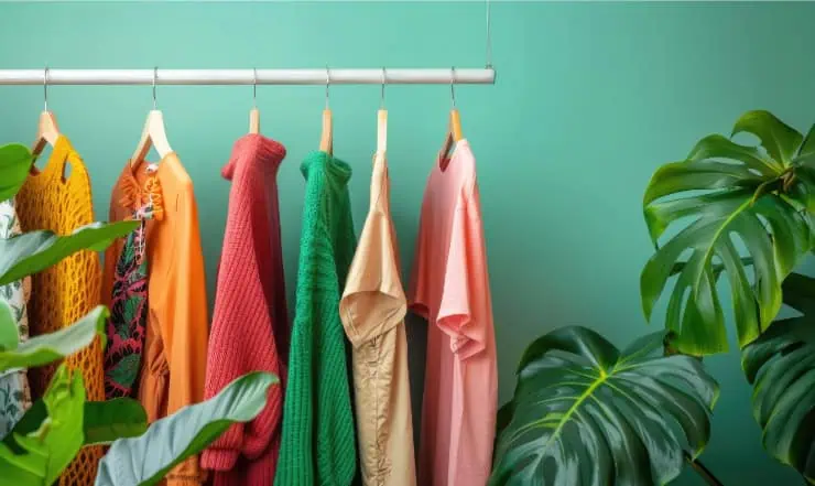
Soft baby pastels like pale pink, powder blue, and mint are often charming in spring but lose their sophistication in winter outerwear. These shades tend to wash out in colder, low-light seasons and can make the complexion appear dull or faded. Baby pastels also highlight inexpensive fabrics because lighter colors expose every crease, wrinkle, and stitching flaw. In mature wardrobes, these hues often read more youthful or overly delicate, which can unintentionally cheapen the overall look.
4. Stark White
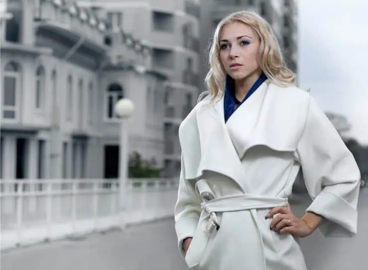
While pure white can look crisp and modern, it is notoriously difficult to maintain especially in heavy winter coats. Even small amounts of lint, dirt, or discoloration become highly visible on bright white fabric, causing the coat to look worn or cheap within a short time. The starkness of this shade can also create a harsh contrast against winter skin tones, emphasizing dryness or unevenness rather than creating a flattering glow. Additionally, unless the material is exceptionally high-quality, white coats often reveal the underlying structure, lining seams, and texture inconsistencies.
5. Yellow-Toned Beige
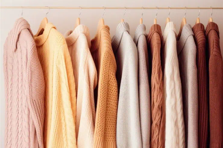
Beige is a classic neutral, but not all beiges are equally flattering. Yellow-toned beige often reads as outdated and can cast a sallow undertone on the skin, especially in colder months when the complexion naturally loses warmth. This shade also has a tendency to flatten the appearance of the coat’s fabric, highlighting low-quality materials or outdated cuts. Even expensive coats can appear off-color or aged in yellow-beige, making it one of the most unreliable winter neutrals.
6. Metallic Silver or Gold
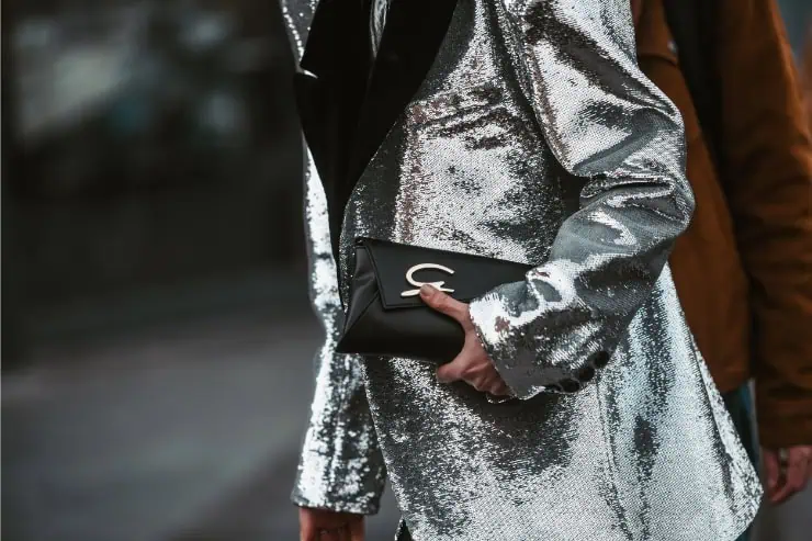
Metallic coats make a bold fashion statement, but they rarely convey sophistication in winter outerwear. Silver and gold fabrics often appear shiny rather than luxurious, drawing attention to wrinkles, creases, and fabric stiffness. These finishes also show wear quickly, especially along seams and sleeves, making the coat appear low-quality after only a few uses. Metallic outerwear can skew costume-like or overly trendy, which shortens its wardrobe lifespan and limits your styling options.
7. Muddy Browns
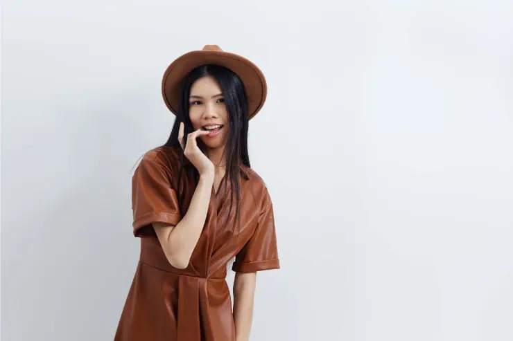
Dark, muddy brown shades tend to dull the complexion and drain warmth from your overall appearance. These browns often read as flat and lifeless, especially in heavy winter fabrics, and can give the impression of an older, worn-out coat regardless of the garment’s actual age. They lack the richness and depth found in more intentional brown hues, making them appear generic or outdated. Muddy browns also limit versatility in styling, often clashing with black and gray two staples in most winter wardrobes.
8. Artificial-Looking Teal
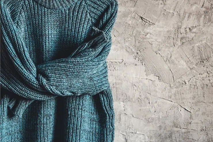
Teal can be a beautiful color, but overly bright, synthetic-leaning teal shades often appear dated or inexpensive. These tones were popular in fast-fashion outerwear, making the color immediately associated with lower-quality garments. Artificial teal tends to accentuate shiny textures, which can make puffer coats or polyester-blend wool appear cheap. This color also clashes with many winter neutrals, making it harder to style in a cohesive, sophisticated way.