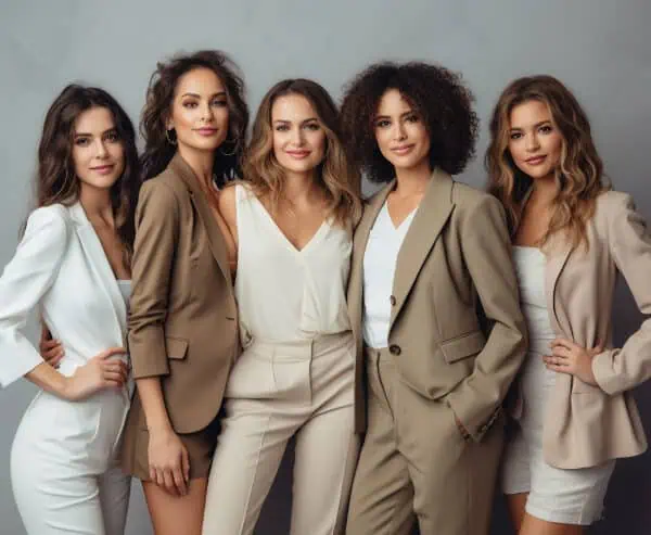
Neutral colors have long been associated with timeless, sophisticated style. For women over 50, neutrals can be especially powerful because they create outfits that look refined without feeling overly complicated. Among the most elegant combinations are cream, camel, and grey three shades that fashion stylists often refer to as “expensive-looking” neutrals. When mixed correctly, these colors create depth, warmth, and balance while maintaining a clean, polished aesthetic. The key lies in understanding how the tones interact with each other and how to build outfits that feel intentional rather than flat. With the right approach, these neutrals can elevate everyday clothing into something effortlessly chic.
Table of Contents
1. Why These Neutrals Look So Sophisticated

Cream, camel, and grey work beautifully together because they belong to complementary neutral families. Cream brings softness and lightness, camel adds warmth and richness, and grey introduces cool balance. When these tones are combined in an outfit, they create subtle contrast without the harshness that sometimes comes with bold colors. This layered neutral palette often appears luxurious because it mimics the color combinations frequently used in high end fashion collections. The harmony between warm and cool shades gives the outfit visual depth while maintaining a calm, elegant appearance.
2. Start With One Neutral as the Base
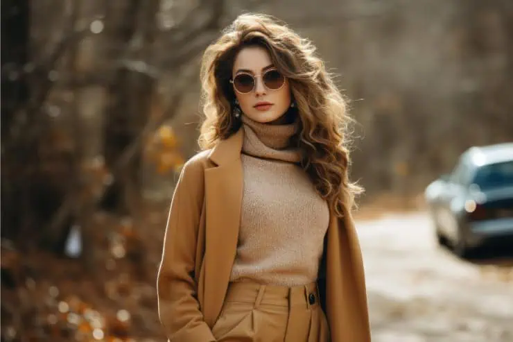
The easiest way to mix neutrals is to begin with one dominant color and build around it. For example, a cream sweater paired with grey trousers creates a soft base, while a camel coat can add warmth as the outer layer. Using one color as the anchor keeps the outfit cohesive and prevents it from looking scattered. Once the base is established, the other neutrals can be introduced through additional clothing pieces, accessories, or outerwear. This approach keeps the overall look balanced while allowing each tone to stand out subtly.
3. Balance Warm and Cool Tones

One reason this combination works so well is the balance between warm and cool hues. Camel is naturally warm, cream sits somewhere in the middle, and grey tends to be cooler. When these tones are mixed thoughtfully, they create visual interest while remaining harmonious. For example, pairing a warm camel coat with a cool grey dress can create a sophisticated contrast. Adding cream elements helps soften the transition between the two tones. The result is an outfit that feels layered and dynamic without appearing busy.
4. Use Texture to Add Depth
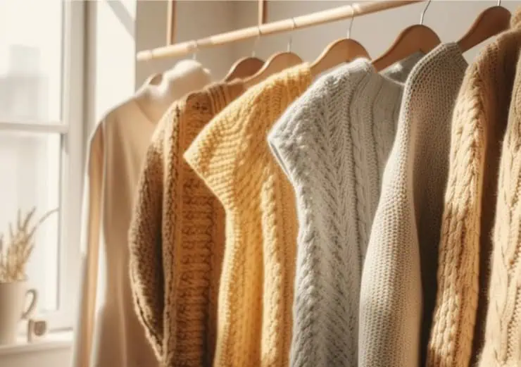
When working primarily with neutrals, texture becomes an important design element. Materials like wool, cashmere, suede, or soft knits can add dimension to the outfit even when the colors are subtle. A cream knit sweater paired with tailored grey trousers and a camel wool coat creates visual richness through both color and fabric. Texture prevents neutral outfits from looking flat and gives them a more luxurious feel. This is one reason neutral palettes often appear so refined in fashion editorials and high-end collections.
5. Keep Accessories in the Same Palette
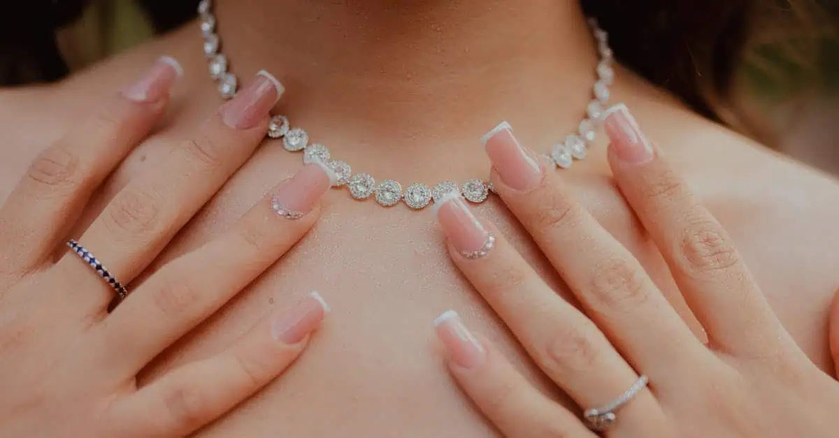
Accessories can help tie the entire neutral palette together. Shoes, bags, belts, and scarves that stay within the cream, camel, or grey range maintain the cohesive look. For example, a camel handbag with a grey outfit or cream shoes paired with a camel coat can subtly reinforce the color story. Metallic accents such as gold or soft silver can also complement these tones without overpowering them. By keeping accessories aligned with the neutral palette, the overall outfit remains elegant, balanced, and effortlessly polished.