Fashion cycles don’t just move forward they reinterpret. What one generation considers elegant and timeless, the next may see as tired or overly nostalgic. Right now, Gen Z has a sharp eye for prints that feel overly familiar, emotionally coded as “safe,” or reminiscent of interiors, upholstery, and wardrobes from decades past. These aren’t bad prints by design but they’ve been worn the same way for too long. The issue isn’t age; it’s repetition without reinvention. When a print carries too much cultural baggage, it stops feeling classic and starts feeling frozen in time. Below are eight once-beloved prints that Gen Z now casually lumps into the category of “retirement home florals” and why they read dated in 2026.
Table of Contents
1. Large, Busy Florals

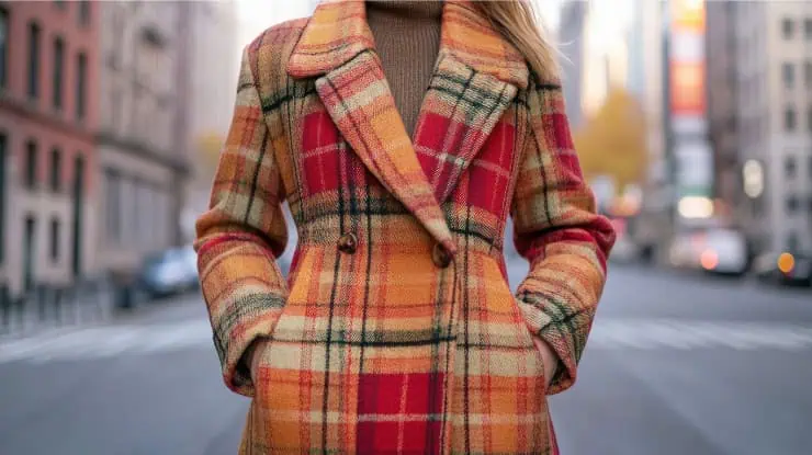
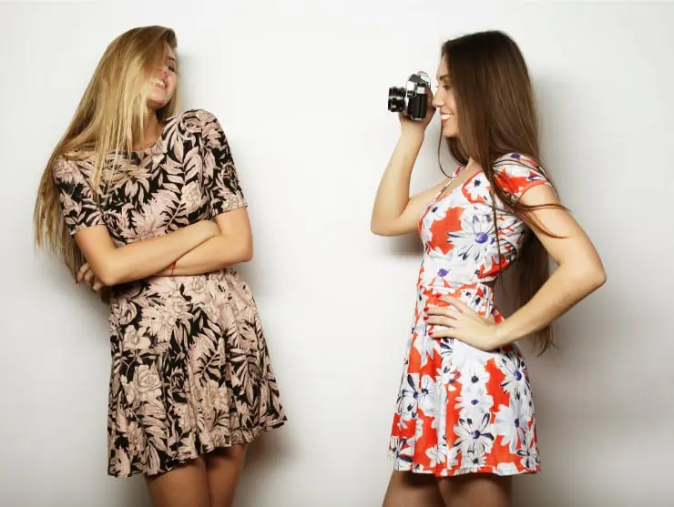
Oversized florals with dense, all over coverage are one of the most commonly cited offenders. These prints often recall vintage sofas, curtains, or special occasion dresses from decades ago. When the flowers are too literal, too colorful, and too evenly spaced, the effect feels decorative rather than fashion-forward. Gen Z tends to favor florals that feel abstract, oversized in a deliberate way, or broken up by negative space. Traditional busy florals feel overly polite and emotionally nostalgic, which reads as dated rather than romantic.
2. Wallpaper Style Botanical Prints
Botanical prints featuring vines, leaves, and small flowers arranged in repetitive patterns often evoke interior design more than clothing. These prints feel borrowed from wallpaper, china, or upholstery objects associated with permanence rather than experimentation. Gen Z tends to avoid anything that looks too “decorative.” When a print feels like it belongs on a wall rather than a body, it’s quickly labeled old-fashioned. The lack of visual tension or contrast makes these prints feel static.
3. Traditional Paisley
Paisley has a rich history, but traditional versions especially in classic jewel tones or muted earth colors feel overly heritage-coded today. Dense, swirling paisleys often read as bohemian in a way that feels stuck in the past rather than expressive. Gen Z gravitates toward cleaner graphics and bolder statements. Without a modern scale shift or unexpected color palette, classic paisley feels like a relic rather than a reinvention.
4. Tiny Gingham Checks
Small-scale gingham, especially in soft pastels or muted tones, often triggers “country” or “old-school” associations. While gingham itself isn’t dead, the delicate, picnic-table versions feel overly sweet and conservative. Gen Z prefers gingham when it’s exaggerated, high-contrast, or styled ironically. Tiny, polite checks worn straightforwardly feel quaint rather than cool.
5. Classic Polka Dots

Uniform, evenly spaced polka dots especially in traditional black and white have become another print Gen Z views skeptically. The predictability of the pattern feels retro without intention. While polka dots can still work in exaggerated or irregular forms, the classic version often reads as costume-adjacent or overly nostalgic. The issue is symmetry without disruption.
6. Ornate Baroque Prints

Baroque and scroll-heavy prints feel visually heavy and emotionally tied to old-world luxury. When worn head to toe, they can resemble upholstery more than fashion. Gen Z tends to reject excessive ornamentation in favor of clarity and contrast. Without modern restraint, baroque prints feel theatrical rather than expressive. When worn head to toe, these prints overwhelm the body and flatten personal style, making the wearer disappear behind the pattern. They also lack visual tension; everything is ornate, so nothing stands out.
7. Muted Floral Stripes
Floral stripes especially those combining vertical lines with small flowers are frequently associated with vintage dresses and home textiles. The combination of order and decoration feels overly traditional. Gen Z prefers prints that either lean fully graphic or fully organic. Hybrid prints like these often fall into an awkward middle ground that reads dated.
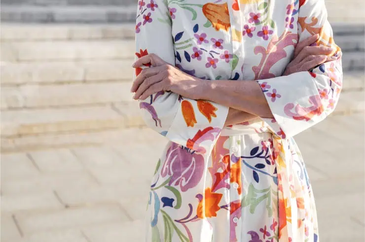
8. Rose Heavy Romantic Prints

Hyper-romantic rose prints, especially in dusty pinks and mauves, are often labeled “retirement home florals” because they feel emotionally loaded with nostalgia. These prints are soft, sentimental, and familiar but familiarity is exactly the problem. Gen Z values novelty and irony. Without a modern silhouette or unexpected styling, rose-heavy prints feel frozen in a different era.