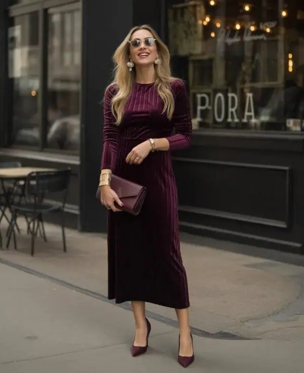
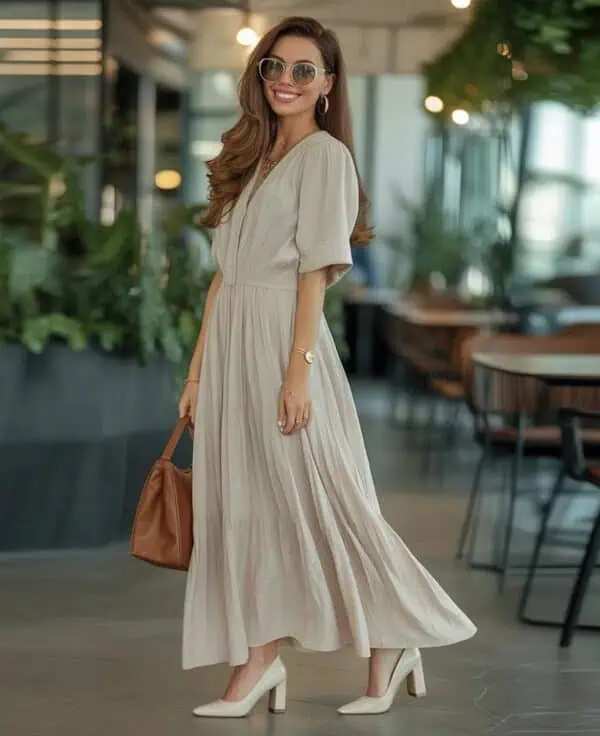
Color has the power to transform an outfit, but certain pairings can quietly age women over 50. While elegance doesn’t depend on chasing trends, the way colors interact can make a wardrobe feel outdated, harsh, or unflattering. Some combinations drain the complexion, while others create a dated effect that takes away from an otherwise chic look. Stylists often recommend softer contrasts, modern neutrals, and intentional pops of color to keep outfits feeling fresh and ageless. To help refine your wardrobe choices, here are six color combinations that may unintentionally age women over 50 and how to update them.
Table of Contents
1. Black and Brown Together
Though both colors are versatile, pairing black and brown often creates a muddled, heavy look that lacks refinement. For women over 50, this combination can feel outdated, as it doesn’t provide the crispness or sophistication that either color offers on its own. Brown, when styled with creams, camels, or rich jewel tones, feels luxurious. Black, when paired with gray, ivory, or bold accents, looks timeless. But when worn together, they clash rather than complement, giving off a drab effect. Elegant women elevate their wardrobes by keeping these shades separate or balancing them with lighter, modern neutrals.
2. Navy and Black
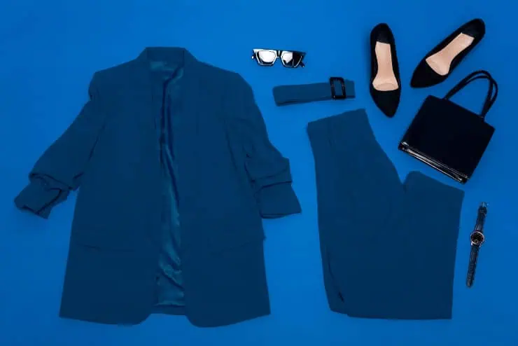
Navy and black are close in tone, and when worn together, they often look like a mismatch rather than a deliberate style choice. Women over 50 may find that this pairing dulls their outfit, especially under dim lighting where the colors blend awkwardly. Navy pairs beautifully with crisp white, camel, or even red for a chic nautical or modern look. Black shines when combined with ivory, metallics, or jewel tones. Keeping navy and black apart helps outfits feel intentional rather than uncoordinated, ensuring the look reads polished and youthful instead of heavy or dated.
3. Beige and Gray

Beige and gray are both neutrals, but together they often create a washed-out effect that lacks vibrancy. For women over 50, this pairing can drain the complexion and give outfits a dull, tired feel. Instead, stylists suggest pairing beige with ivory, navy, or warm camel to highlight its elegance. Gray looks striking with pastels, bold brights, or metallic accents that lift its cool tone. While beige and gray may seem like a safe combination, it usually lacks the energy and contrast needed to keep an outfit looking fresh, flattering, and age-appropriate.
4. Pastels on Pastels
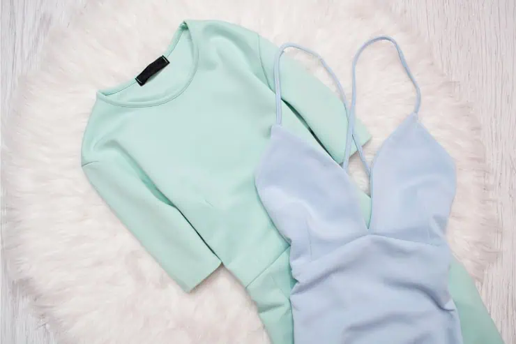
Soft pastel combinations like baby blue with pale pink or lavender with mint may appear overly sweet, which can unintentionally age women over 50. These pairings can evoke a childish or outdated vibe, especially when styled head-to-toe. While pastels can still be worn beautifully, they work best when balanced with grounding neutrals or deeper shades. For instance, a pastel blouse looks modern with white trousers or navy accents. By mixing light tones with richer colors, women achieve elegance without appearing washed out, proving that pastels require contrast to remain chic and contemporary.
5. Red and Green

Outside of December, red and green together almost always evoke holiday associations, which can make an outfit feel costume-like and dated. Women over 50 may find this combination distracting rather than chic. Instead, red looks elegant paired with neutrals like camel, black, or navy, while green shines when matched with ivory, gray, or earthy tones. Both colors can be striking when styled individually, but together they rarely read as sophisticated. By separating red and green into distinct outfits, women can enjoy their vibrancy without the risk of looking seasonally themed.
6. Yellow and Purple

Yellow and purple sit opposite on the color wheel, making them complementary but in fashion, the clash can be too stark. On women over 50, this combination often feels garish and overwhelming, drawing attention away from the wearer instead of highlighting her. Yellow shines when paired with white, gray, or navy, while purple feels regal alongside black, beige, or metallics. Wearing them together tends to emphasize contrast in a way that feels theatrical rather than elegant. For a more timeless look, it’s best to separate these shades or tone them down with sophisticated neutrals.