Each year, the fashion and design worlds rally around a handful of defining shades, and in 2026 one soft neutral is already gaining momentum: Cloud Dancer. Positioned as a calming, versatile off-white, it’s appearing across fashion, interiors, and branding palettes. On paper, it checks every box elegant, wearable, seasonless, and easy to pair. Yet stylists and color analysts are quietly skeptical. They note that Cloud Dancer’s biggest strengths subtlety and neutrality may also make it vulnerable to overuse and rapid fatigue. When a color becomes too safe and too ubiquitous, it risks losing character.
Table of Contents
1. It’s Another “New Neutral” in an Already Saturated Market

Fashion has cycled through countless elevated neutrals over the past decade ivory, ecru, bone, oat, chalk, and warm white variations have all had their moment. Cloud Dancer enters a market already crowded with near-identical shades, making it feel less like a fresh direction and more like a subtle rename. Stylists point out that most consumers struggle to distinguish between these micro-neutrals in real wardrobes. When differentiation is minimal, excitement fades quickly. A color positioned as new but visually familiar risks feeling manufactured rather than inspiring. This saturation is often the first sign a trend color may be overhyped before it fully matures.
2. Its Safety May Limit Visual Impact
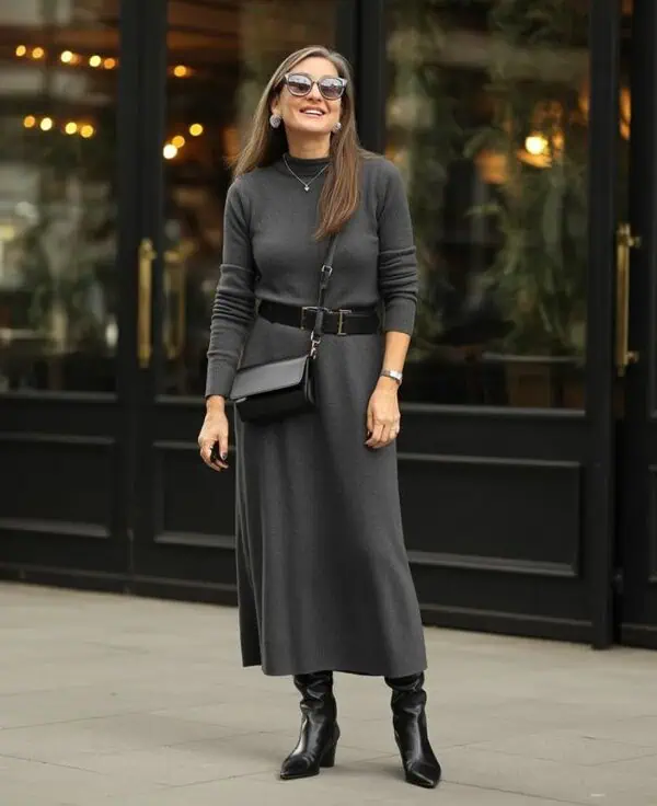
Cloud Dancer’s appeal lies in its softness and versatility, but that same restraint can dilute presence in fashion. Colors that generate lasting excitement often introduce contrast or emotional charge. Cloud Dancer, by design, recedes rather than stands out. In outfits, it tends to blend into surrounding neutrals instead of anchoring a look. Stylists note that consumers drawn to expressive dressing may find it underwhelming, while minimalists already own similar shades. Without strong visual identity, a trend color risks becoming background rather than statement. Over time, this lack of impact can make widespread adoption feel repetitive rather than inspiring.
3. It Photographs Beautifully Which Encourages Overuse

Soft off whites like Cloud Dancer perform exceptionally well in photography. They reflect light evenly, flatter skin tones, and create airy visuals favored by social media and branding aesthetics. This photogenic quality accelerates adoption across fashion campaigns, interiors, and digital design. However, when a color saturates visual platforms quickly, fatigue follows just as fast. Consumers begin to perceive it as everywhere at once. Stylists have observed this pattern repeatedly: colors that dominate curated imagery often peak early and decline abruptly. Cloud Dancer’s camera friendly nature may unintentionally speed its lifecycle from trend to cliché.
4. It Can Wash Out Real World Styling

While Cloud Dancer looks luminous in controlled lighting, it can behave differently in everyday environments. Under indoor lighting or against pale skin tones, it may appear flat or slightly dull rather than glowing. Stylists note that many off-whites require careful contrast texture, layering, or darker companions to maintain definition. Without that styling, garments can lose shape visually. This makes the color less forgiving than expected for consumers seeking easy neutrals. When a trend color requires more styling effort than advertised, disappointment often follows. That gap between expectation and reality contributes to perceptions of overrating.
5. It Risks Feeling Generic Across Categories

Cloud Dancer’s neutrality allows it to move easily between fashion, interiors, packaging, and branding. While this versatility seems like a strength, it can also dilute identity. When the same shade appears in clothing, home décor, cosmetics, and marketing visuals simultaneously, it begins to feel generic rather than distinctive. Consumers subconsciously associate uniqueness with exclusivity. A color used everywhere loses that sense of specialness. Stylists often note that true standout shades carry a recognizable emotional tone. Cloud Dancer’s broad adaptability may ironically undermine memorability, making it feel like a default choice rather than a defining one.