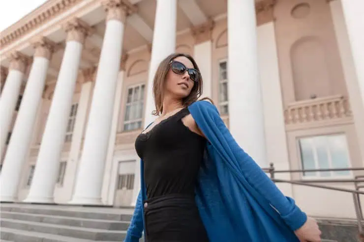
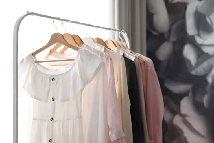
Some colors whisper, others shout but a select few have presence. They stand out without being flashy, elevate outfits without trying, and draw the eye in a way that feels calm yet compelling. Stylists often say mature style isn’t about being louder, brighter, or trendier it’s about choosing colors that flatter the skin, hold depth, and signal quiet confidence. When women feel overlooked, washed-out, or invisible in winter neutrals, the right shade can change everything. Below are nine colors that make people notice you gently, naturally, and with elegance while still feeling timeless and wearable in everyday life.
Table of Contents
1. Deep Teal
Deep teal has a magnetic quality rich enough to feel intentional but soft enough to remain sophisticated. Stylists love it because it flatters nearly every undertone, brightening the eyes and giving the skin a subtle lift. It has the presence of jewel tones without being sharp like emerald or flashy like bright turquoise. Teal communicates intelligence and depth, making it a favorite for blazers, silk blouses, and knitwear worn near the face. Unlike black, which can feel flat, teal reflects light and adds dimension.
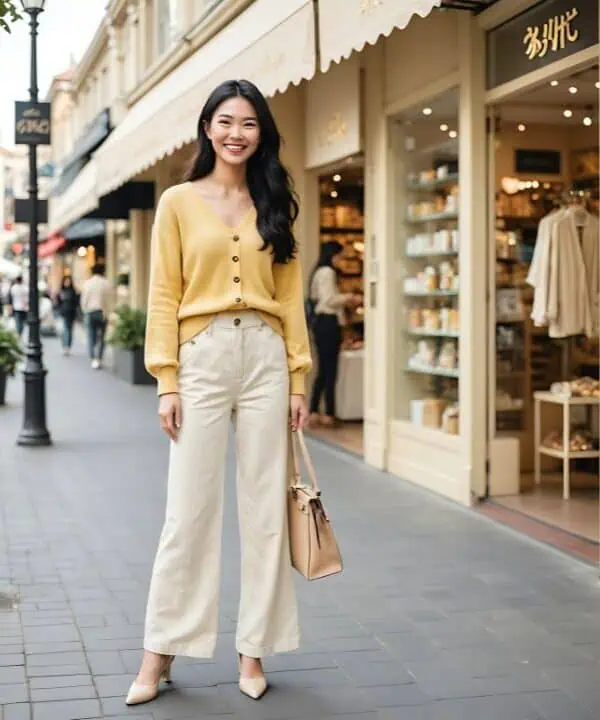
2. Soft Ivory
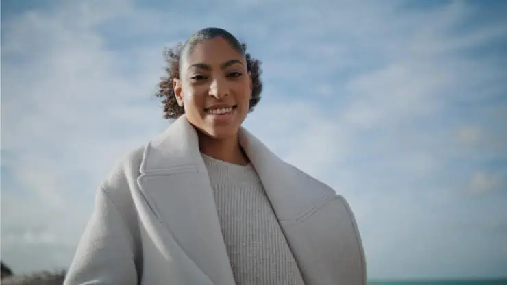
Ivory isn’t loud but it glows. It softens harsh lighting, minimizes shadows, and brings light toward the face, which is why stylists say it can make mature skin look instantly rested. It feels timeless, clean, and refined, evoking quiet luxury far more than bright white ever could. While many neutrals blend into the background, ivory stands out by adding clarity and calm. An ivory sweater, coat, or scarf can elevate even simple denim or trousers. The beauty is in its restraint ivory doesn’t demand attention, it draws it naturally. People tend to say, “You look lovely,” rather than “nice shirt,” meaning they notice you, not the clothes.
3. Charcoal Gray
Charcoal sends a message of intention more thoughtful than black, more modern than light gray. The depth of the shade sharpens lines and defines silhouette, which is especially flattering in coats, trousers, and tailored pieces. Charcoal has the quiet authority often associated with great style: minimalist, confident, grown woman energy. It pairs seamlessly with camel, blush, silver, and jewel tones, allowing accessories or textures to shine. Even in a room full of black outfits, charcoal reads elevated and considered. It’s a color that signals you care about quality and detail without announcing it.
4. Warm Camel
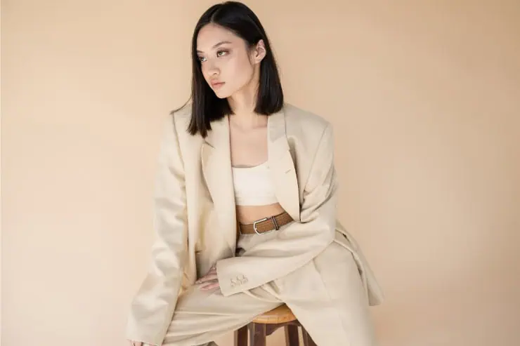
Camel is one of the most luxurious-looking neutrals rich, creamy, and visually warm. It holds light beautifully, enhancing depth in winter layers rather than dulling them. Stylists love camel because it reads expensive regardless of actual price and pairs effortlessly with denim, black, ivory, burgundy, and gold accessories. Camel isn’t bold, but people notice it because it looks curated. A camel coat alone can transform basic jeans into a striking outfit.
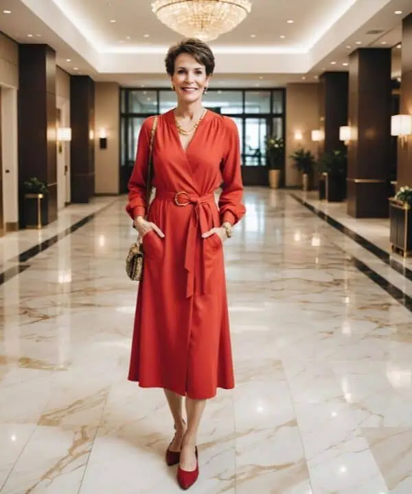
5. Burgundy / Deep Wine
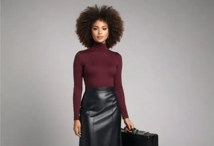
Burgundy captivates through subtle drama. It’s more refined than red yet still rich enough to draw the eye. The tone carries emotional depth warm, inviting, confident and pairs well with neutrals like navy, camel, charcoal, and cream. Stylists often use burgundy to introduce color into minimalist wardrobes because it remains sophisticated while still noticeable. It flatters most skin tones, adding warmth and enhancing lip color and eyes. In handbags, boots, sweaters, or even a simple scarf, burgundy gives outfits presence.
6. Forest Green
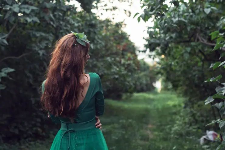
Forest green has a serene strength that feels grounded and intelligent. It stands out in a subtle way less expected than navy, softer than black, and richer than olive. The shade holds depth, making fabrics look luxurious, especially in wool, velvet, or satin. Stylists often recommend it for women who want color without brightness, something that commands respect but still feels calm. Forest green enhances hair and eye colors beautifully, making features sharper and skin warmer. In a crowd of neutrals, it’s noticeable precisely because it’s understated.
7. Slate Blue / Dusty Blue
Slate blue is quiet, misty, and incredibly sophisticated. It’s softer than navy and more interesting than pastel an elegant midpoint that flatters mature skin by reducing harsh contrast. Stylists love it because it whispers luxury; it feels European, minimal, effortless. The color pairs beautifully with silver jewelry, gray wool, ivory, and soft textures like cashmere. What makes slate blue attention-holding is its rarity it’s not a color most people reach for, so when someone wears it, it stands out instantly. It’s the type of blue that makes people lean in for a second look, intrigued rather than overwhelmed.
8. Chocolate Brown
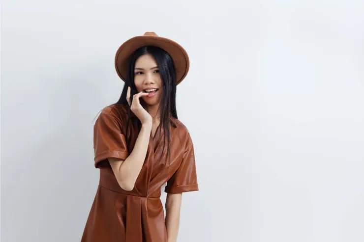
Chocolate brown is warm, enveloping, and rich like espresso. It suggests refinement without the severity of black. Stylists point out that deep brown enhances warmth in the skin and adds depth to winter outfits, especially when layered with camel, ivory, or gold tones. It feels grounded and sensual strong but not shouty. The richness of chocolate brown reads luxurious even in basic cuts. A chocolate coat or knit can make everyday outfits look curated and intentional. People notice the softness and richness of the color long before they recognize what makes the outfit memorable. It’s quiet but unforgettable.
9. Muted Rose / Dusty Blush
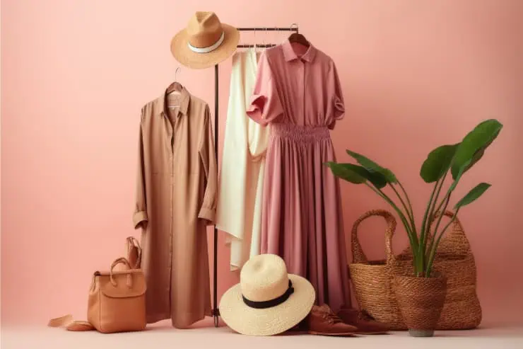
Muted rose is the most delicate attention-grabber on the list, but don’t underestimate it. On mature skin, it adds life, softness, and glow without tipping into bubblegum or overly feminine territory. It works particularly well near the face in scarves, blouses, or knitwear where it reflects warmth upward. Stylists love this shade because it creates instant approachability warm, friendly, and confident. Muted rose pairs with ivory, gray, olive, and denim effortlessly. People notice it because it feels gentle and flattering rather than bold. It’s a color that gets “You look radiant” rather than “Great top.” That is the essence of quiet impact.