When winter arrives, many women instinctively reach for familiar, neutral colors that feel dependable and easy to wear. Black, gray, beige, and muted tones often feel like the safest choices when light fades and wardrobes grow heavier. But stylists consistently point out that these so called “safe” colors can unintentionally drain warmth from the complexion especially as skin matures and loses some natural contrast. The issue isn’t age; it’s undertone, depth, and how winter light interacts with fabric color near the face.
Table of Contents
1. Stark Black Worn Close to the Face

Black is often treated as the ultimate flattering color, but stylists say it’s one of the most common complexion drainers in winter. Against pale winter light, stark black can create harsh contrast that emphasizes fine lines and shadows, especially on mature skin. As natural facial contrast softens with age, black near the face can feel heavy rather than chic. This doesn’t mean eliminating black it means reconsidering placement.
2. Cool, Flat Gray
Cool gray feels neutral and polished, but in winter it often drains warmth from the skin. Stylists note that flat gray lacks depth and can reflect dull light upward, making the complexion appear tired or sallow. This is especially true for gray worn in knits, scarves, or tops close to the face. Without warmth or texture, gray can feel lifeless. Warmer grays, charcoal with depth, or gray paired with a warmer accent color look far more flattering. Gray isn’t the issue flat, cool gray worn alone is.
3. Beige That’s Too Close to Your Skin Tone

Beige is a classic “safe” color, but stylists say it’s one of the trickiest neutrals. When beige is too similar to your skin tone, it can wash you out completely. In winter light, this effect is amplified, making the face look faded or undefined. Beige works best when it contrasts slightly with the skin or is paired with stronger supporting colors. Warmer camel tones or textured fabrics help prevent beige from blending into the complexion. When beige disappears into the skin, so does your glow.
4. Dusty Pastels

Muted pastels like dusty pink, pale lavender, or washed-out blue often feel gentle and feminine, but stylists say they can drain mature skin in winter. These colors lack saturation, which means they don’t reflect enough light back onto the face. Instead of softness, they create dullness. Winter requires depth and richness to counteract low light. Clearer, slightly deeper versions of pastels tend to be far more flattering. Dusty tones near the face can emphasize fatigue rather than freshness.
5. Olive Green With Too Much Gray

Olive green is often marketed as universally flattering, but not all olives are equal. Gray-heavy olive tones can pull greenish or muddy against the skin, especially in winter. Stylists say these shades can make the complexion appear dull or uneven. Olive works best when it leans warmer or richer. When it’s too muted, it absorbs light instead of reflecting it. Pairing olive with warm metals, creamy whites, or richer browns can help but on its own, gray-leaning olive often drains warmth.
6. Icy White
Bright, icy white can look crisp, but in winter it often creates too much contrast with mature skin. Stylists say stark white near the face can exaggerate redness, shadows, and texture. Softer whites like cream, ivory, or winter white are far more forgiving and flattering. These warmer alternatives still feel clean without harshness. Icy white tends to reflect cold light upward, which works against skin warmth. Choosing a slightly softer white makes outfits feel fresher and more intentional.
7. Muted Navy
Navy is often recommended as a softer alternative to black, but muted or overly dark navy can be just as draining. Stylists explain that when navy lacks depth or richness, it absorbs light and dulls the complexion. In winter, this effect is magnified. Rich, inky navy or navy paired with lighter accents works better. Flat navy worn alone near the face can feel heavy and somber. Navy needs contrast to shine.
8. Taupe With Too Much Gray

Taupe feels elegant and understated, but gray-heavy taupe can make skin look flat and tired. Stylists say this color often drains warmth because it sits in an awkward middle ground neither rich nor light. In winter, taupe benefits from texture and warmth. When worn alone, it can disappear visually. Warmer taupes or taupe paired with gold, camel, or soft white creates balance. Without warmth, taupe becomes lifeless.
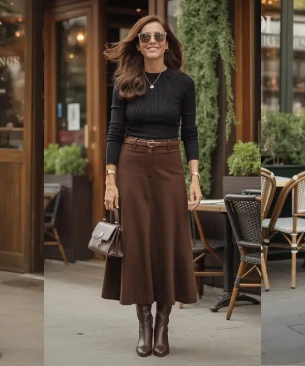
9. Muted Brown Without Warmth
Brown is often assumed to be warming, but muted or cool browns can have the opposite effect. Stylists note that gray-based browns can make skin appear dull or ashy, especially in winter light. Brown works best when it has richness think chocolate, cognac, or warm espresso. Flat, dusty browns lack energy and reflect very little light. When brown drains the complexion, it’s usually because it’s missing warmth and depth.
10. Washed Out Denim Blue
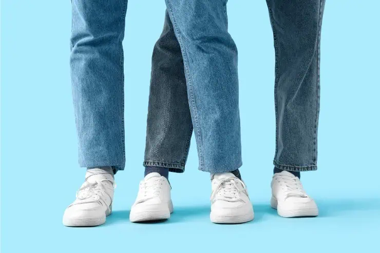
Light, faded denim blues often feel casual and easy, but stylists say they can wash out mature skin in winter. These blues lack saturation and contrast, which makes the face look tired. Darker, cleaner denim shades reflect light better and feel more polished. Washed out blues work best away from the face or balanced with stronger colors. In winter, depth matters more than familiarity.