For years, navy has been the default “safe” alternative to black polished, dependable, and endlessly wearable. But Spring 2026 is ushering in a subtle shift toward a lighter, more luminous neutral: deep slate blue. Sitting between blue-gray and softened indigo, this shade keeps navy’s sophistication while feeling fresher and more modern. Stylists love it because it brightens wardrobes without losing versatility. Unlike stark brights or trend colors, deep slate blue integrates seamlessly into existing closets while softening contrast against the skin. The result is a neutral that feels elevated yet easy exactly what many wardrobes are craving after seasons dominated by darker tones.
Table of Contents
1. Softer Than Navy, Yet Equally Polished

Navy can sometimes appear dense or heavy, especially in spring light. Deep slate blue lightens that visual weight by blending blue with gray undertones. The effect is gentler and more diffused, which keeps outfits refined without looking dark. Tailoring in this shade feels sophisticated but less formal than navy suiting. Dresses and knits look airy rather than serious. Because the color carries subtle softness, it adapts across casual and polished pieces effortlessly. Stylists note that slate blue maintains structure while removing severity, making it a natural evolution from navy rather than a replacement.
2. Brightens the Complexion Subtly

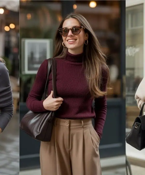
Dark navy can create strong contrast against skin, sometimes emphasizing shadows or sallowness. Deep slate blue reflects light more softly due to its gray influence, which flatters a wider range of complexions. It appears luminous without being bright. Near the face such as in tops, scarves, or outerwear the shade gently enhances clarity rather than draining color. This is especially noticeable in daylight, where slate tones harmonize with natural skin undertones. Stylists often recommend it for those who find navy too stark but still want a cool-toned neutral. The result is a fresher, more balanced facial frame.
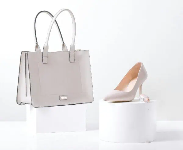
3. Pairs Seamlessly With Existing Neutrals
One reason slate blue is gaining traction is its compatibility with core wardrobe colors. It blends effortlessly with white, cream, gray, camel, denim, and even black. Unlike trend colors that demand new combinations, slate integrates into familiar palettes. This makes it easy to adopt without overhauling a wardrobe. A slate blazer works with white trousers; slate knits pair with denim; slate dresses complement tan accessories. The color behaves like a neutral while adding subtle dimension. Stylists appreciate shades that expand outfits without complexity, and slate blue does exactly that.
4. Feels Modern Without Being Trendy

Many seasonal colors feel temporary because they rely on novelty. Deep slate blue reads modern through nuance rather than brightness. Its understated tone feels current but not fashion dependent, which increases longevity. Pieces in this shade won’t date quickly because the color sits within the neutral spectrum. This aligns with the broader shift toward quiet luxury and refined minimalism, where subtlety signals sophistication. Stylists favor hues that evolve wardrobes rather than replace them, and slate blue fits this philosophy. It refreshes staples without sacrificing timelessness.
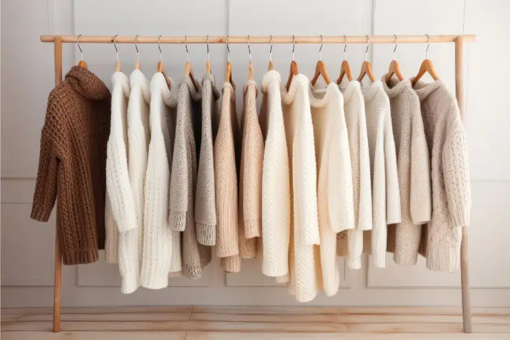
5. Works Across Fabrics and Textures

Slate blue adapts beautifully across materials, which contributes to its versatility. In tailoring, it looks crisp and structured. In knits, it appears soft and cozy. In silk or satin, it gains depth and sheen. This flexibility allows the shade to span seasons and styles without losing identity. Some colors shift dramatically depending on fabric, but slate maintains its calm elegance across textures. This consistency makes it reliable for wardrobe building. Stylists often select colors that behave predictably in multiple contexts, and slate blue’s adaptability supports that need.
6. A Natural Bridge From Winter to Spring

Seasonal transitions often challenge wardrobes. Winter’s deep tones can feel too heavy for spring, while pastels may feel abrupt. Deep slate blue bridges this gap perfectly. It retains depth reminiscent of winter while introducing the lightness associated with spring. Layered with lighter fabrics or neutrals, it signals seasonal change without dramatic contrast. This transitional quality makes it especially useful in outerwear and tailoring. Stylists value colors that extend wear across seasons, and slate blue’s balance of depth and softness makes it ideal for this shift.