Color has a powerful effect on how clothing interacts with your face, skin tone, and overall presence, yet most people choose it based on preference rather than harmony. That’s why certain garments seem to make you look vibrant and polished while others appear dull, harsh, or aging even when the fit is perfect. Color analysis is the method of identifying which hues naturally enhance your complexion, contrast level, and undertone so everything you wear works with your features rather than against them. Once understood, it simplifies shopping, styling, and wardrobe coordination dramatically. Instead of guessing, you know exactly which shades illuminate you, which neutrals replace black, and why some colors consistently feel right.
Table of Contents
1. Undertone: The Foundation of Why Colors Flatter or Clash

Undertone refers to the subtle temperature beneath your skin warm, cool, or neutral which determines whether certain colors harmonize with your complexion or compete against it. Warm undertones typically glow in earthy, golden, or peach-based hues, while cool undertones are enhanced by blue-based, rosy, or jewel tones. When clothing aligns with undertone, skin appears clearer, brighter, and more even, while eyes and natural coloring stand out effortlessly. When colors oppose undertone, the face can look tired, shadowed, or slightly gray regardless of makeup. Many people confuse surface skin tone with undertone, leading to mismatched palettes.
2. Contrast Level: Matching Color Intensity to Your Features

Beyond undertone, the level of contrast between your hair, skin, and eyes influences how strong or soft your clothing colors should be to maintain visual balance. High contrast individuals such as those with dark hair and light skin or vivid eye color can carry bold, saturated hues and sharp color pairings without being overwhelmed. Low contrast individuals, whose features blend softly together, look more harmonious in muted, blended, or tonal palettes rather than stark combinations.
3. Seasonal Palettes: Why Some Color Families Feel Instantly Right

Color analysis systems often group undertone and contrast into seasonal palettes typically spring, summer, autumn, or winter each representing a family of hues sharing temperature and intensity. These palettes explain why certain shades consistently flatter while others rarely do, even across different garments. For example, warm and earthy palettes harmonize with golden undertones, while cool and crisp palettes complement blue-based coloring.
4. Neutrals: Choosing Your Version of Black, White, and Beige
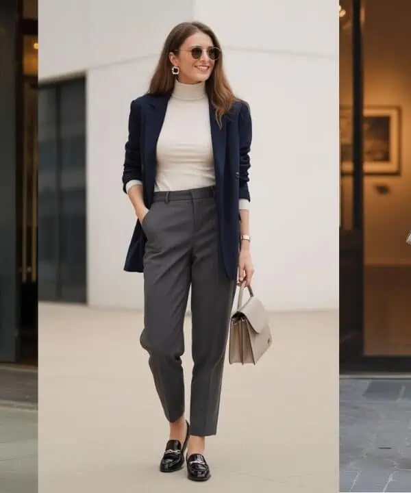
One of the most practical benefits of color analysis is discovering which neutral tones replace universal staples like black, white, or beige, which are not universally flattering. Some complexions appear drained in pure black but glow in deep navy, charcoal, or espresso. Similarly, stark white may feel harsh on softer coloring that benefits from cream or ivory instead. Identifying personal neutrals ensures foundational wardrobe pieces harmonize with skin tone and undertone, making outfits look polished without effort.
5. Fabric and Finish: How Texture Changes Color Perception
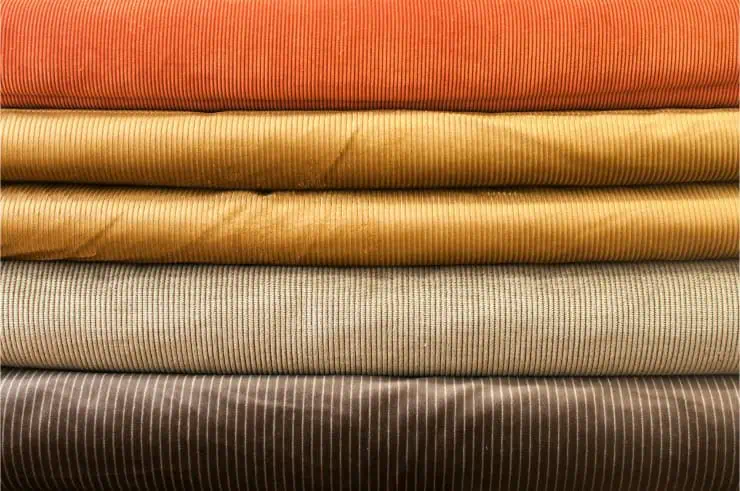
The same color can appear dramatically different depending on fabric texture and surface finish, which is why some shades flatter in one garment but not another. Matte fabrics diffuse light and soften color impact, making them ideal for subtle palettes or low contrast coloring, while glossy or saturated fabrics intensify hue and reflect light, suiting higher-contrast features. Metallic sheen, pile fabrics like velvet, or translucent materials all alter how color interacts with the face. Understanding this interaction explains why a color might feel too strong in satin but perfect in wool, or too dull in cotton but vibrant in silk.
6. Placement: Why Colors Near the Face Matter Most

Not every color in an outfit affects appearance equally; shades worn near the face have the strongest visual impact because they reflect directly onto the skin. Tops, scarves, collars, and jewelry therefore influence complexion far more than skirts, trousers, or shoes. This principle allows people to enjoy non-flattering colors away from the face while reserving their best hues for upper garments. When the right colors frame the face, skin appears brighter and more even, reducing reliance on makeup and enhancing overall vitality.