Color has a powerful effect on how youthful, energized, and radiant your skin appears especially after 50. The right shades can lift the complexion, smooth the appearance of fine lines, and brighten the face instantly. But the wrong colors can do the opposite, making skin look washed out, tired, or flat. Fortunately, these mistakes are easy to identify and even easier to fix. By understanding which undertones work for you and which colors to avoid (or adjust), you can transform your wardrobe and your glow. Here are the nine color mistakes that stylists say dull mature skin the fastest.
Table of Contents
1. Wearing Colors That Don’t Match Your Undertone

The biggest color mistake women make at any age is choosing shades that clash with their natural undertone. Skin with warm undertones looks radiant in earthy or golden-based colors, while cool undertones glow in jewel or blue-based tones. When you wear the opposite, your complexion can appear sallow, gray, or flat. Many mature women unknowingly gravitate toward “safe” neutrals that don’t actually suit them. A quick test: hold gold and silver near your face. If gold brightens you, you’re warm; if silver does, you’re cool. Wearing harmonious colors revives mature skin instantly, making it appear fresher and more alive.
2. Choosing Harsh, Overly Dark Shades
Head-to-toe black or deep charcoal may seem sophisticated, but harsh dark shades can cast shadows on the face, emphasizing lines, hollows, and texture. On mature skin, this can lead to a dull or tired look. Dark colors absorb light instead of reflecting it, which is why older complexions often appear more vibrant in mid-toned or softly saturated shades. You don’t need to give up dark colors just avoid overwhelming your features with them. Add a lighter scarf, a soft-colored top near your face, or a warm-toned accessory to balance the darkness and bring life back to your complexion.
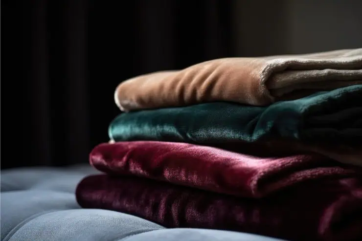
3. Wearing Muted, Dusty Colors That Flatten the Skin
Muted shades like dusty rose, faded lavender, olive gray, or washed-out mauve can make mature skin appear dull because these colors lack vibrancy. Their lack of saturation reduces contrast against the face, leading to a washed-out look. Many women choose these shades because they seem subtle or refined, but they can drain warmth and definition from the skin. Instead, reach for mid-tone versions of these colors richer rose, true plum, fresh lavender, or deep olive. These shades maintain sophistication but provide enough energy to brighten your features, giving your skin a more youthful glow.
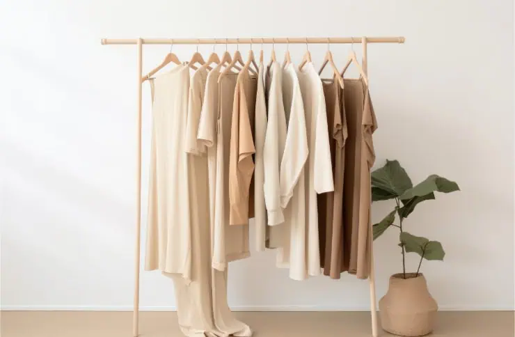
4. Relying Too Heavily on Beige and Taupe

Beige and taupe are common wardrobe staples, but they’re also notorious for washing out mature skin. These neutrals can blend too closely with the skin tone, eliminating contrast and making the complexion appear flat or tired. While these colors can work in pants, coats, and accessories, wearing them right next to the face often dulls your natural warmth. If you love lighter neutrals, try ivory, cream, soft camel, or warm stone their subtle warmth reflects light beautifully and enhances mature features. A small shift in undertone can make a dramatic difference in how radiant your skin looks.
5. Wearing Cool Grays When You Have Warm Undertones

Cool grays have a blue or silver cast that often clashes with warm skin, making it look ashy or lifeless. Many women over 50 gravitate toward gray because it feels modern and safe, but not all grays are created equal. If you have warm undertones, choose greige, warm charcoal, or stone with a beige or taupe base. These options complement your natural warmth and add softness to your overall coloring. Wearing the wrong gray can age your complexion instantly, but the right gray adds depth and sophistication without dulling your glow.
6. Ignoring the Power of Contrast

As we age, natural facial contrast often decreases hair becomes lighter or softer, brows lighten, and skin becomes more even in tone. Wearing low-contrast colors (like pale pastels or light neutrals) can make you look washed out if your natural contrast is already low. On the other hand, the right level of contrast medium or slightly higher adds definition and life to mature skin. Rich jewel tones, deeper neutrals, and saturated mid-tones often do the trick. You don’t need dramatic brights; you just need colors that help your features stand out rather than blend in.
7. Choosing Yellow-Based Whites Instead of Soft Whites or Creams

Bright, stark white can be tricky on mature skin because it reflects light harshly and can emphasize texture or uneven tone. Meanwhile, yellow-based whites can make skin appear sallow. The most flattering alternative for mature complexions is soft white or cream warm enough to add glow, but not so yellow that it clashes with undertones. These softer whites reflect light gently, helping the skin appear smoother, more even, and subtly illuminated.
8. Avoiding All Bright Colors Out of Fear

Many mature women shy away from bright colors, thinking they’re too bold or youthful. But avoiding them entirely can actually make the skin look dull. A touch of brightness like sapphire blue, emerald green, raspberry, or coral can energize the complexion and create a healthy radiance. The secret is choosing brights that complement your undertone. You don’t need neon or flashy shades; simply adding a lively color in a scarf, sweater, or blouse can lift your entire appearance.
9. Wearing Colors You Loved 20 Years Ago Without Updating Them

One of the most common mistakes is sticking to colors that used to flatter you decades ago. Skin tone naturally shifts with age becoming cooler, warmer, or softer over time so colors that once looked perfect may now look dull or harsh. Regularly reassessing which hues brighten your face is essential. Try holding clothing near your face in natural light and notice which shades make your eyes look clearer and which make your skin appear tired. Updating your color palette every few years helps ensure your wardrobe is working with your current complexion, not against it.