Monochrome dressing is one of the easiest ways to look polished, modern, and put together, but it’s also surprisingly easy to get wrong. While wearing one color from head to toe can create length and cohesion, it can also backfire making your outfit look flat, shapeless, or unintentionally outdated. The key is learning how to work with tones, textures, proportions, and subtle contrasts so your monochrome outfits feel sleek rather than bland. Below are the most common mistakes and the simple adjustments that make your look instantly more elevated.
Table of Contents
1. Wearing One Flat Shade Without Any Tonal Variation
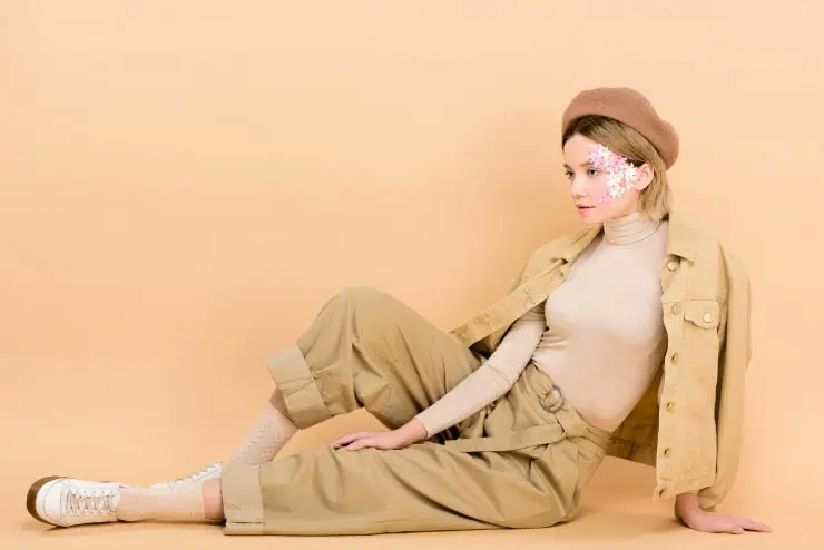
A head to toe outfit in one exact shade can look stiff and almost uniform-like, especially if the color is very dark or very light. Without tonal variation, the body loses definition and the outfit loses depth. Instead, breaking the look into three or more tones like charcoal, slate, and soft grey adds richness while staying true to the monochrome theme. Layering tones creates visual interest, prevents flatness, and makes the outfit look more intentional and contemporary.
2. Ignoring Texture, Which Makes the Outfit Look Blunt

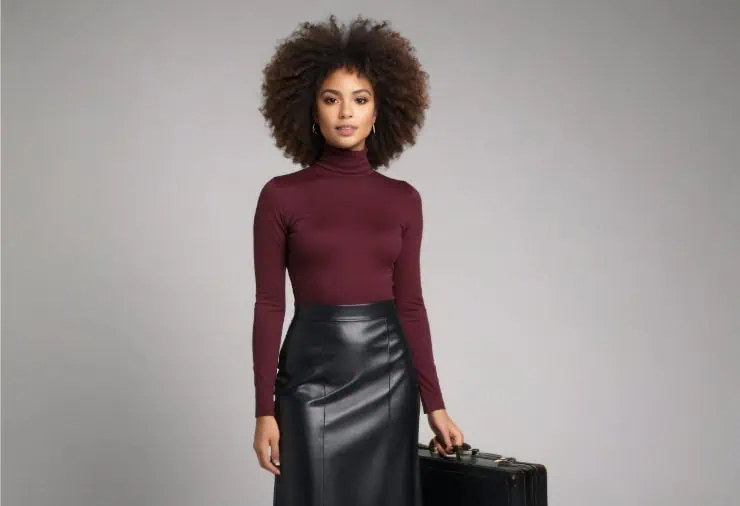
Wearing all the same texture like knit paired with knit can make a monochrome look feel heavy and shapeless. Textures are what bring dimension to a single-color outfit. Mixing wool with leather, silk with denim, or cashmere with structured cotton keeps the eye moving and prevents the outfit from blending into one block. Even pairing matte and slight sheen finishes can transform the overall effect and add quiet sophistication without breaking the monochrome rule.
3. Choosing Unflattering Silhouettes Just Because They Match

Sometimes monochrome outfits go wrong because the pieces match in color but not in shape, fit, or style. Oversized tops with loose pants in one color can make the body appear wider and undefined. To avoid this, balance proportions intentionally pair slim trousers with a relaxed knit or wide-leg pants with a fitted top. When the silhouette is flattering, the monochrome palette enhances elegance instead of highlighting shapelessness.
4. Forgetting to Define the Waist
A monochrome palette can unintentionally erase the waist, especially in winter when layers add bulk. Without definition, the outfit can look boxy and age you visually. Adding a belt in the same color family, choosing pieces with built in shaping, or using the half tuck technique brings structure back to the look. Even subtle waist definition creates length, sharpness, and a more sculpted silhouette, all while staying fully monochrome.
5. Mixing Undertones That Clash

Even within the same color family, undertones matter. Combining warm beige with cool grey-beige can make the outfit look mismatched rather than intentionally monochrome. The eye senses something is “off,” even if the colors seem similar. Sticking to either warm or cool undertones within one outfit ensures harmony. Once you train your eye to notice undertones smoky vs. creamy, icy vs. warm the entire monochrome look appears cleaner and more expensive.
6. Wearing Monochrome Without a Focal Point

A monochrome outfit without a focal point can feel forgettable and lacking personality. You don’t need a bold statement piece just a quiet detail that anchors the look. This could be a structured bag, a textured coat, a sleek pair of boots, or even an elegant neckline. These subtle focal points prevent the outfit from blending into itself and bring a modern, elevated feel while keeping the monochrome palette intact.
7. Choosing Colors That Don’t Complement Skin Tone

Monochrome is powerful, but when the chosen color washes out your complexion, it affects the entire outfit. Wearing pale beiges, icy greys, or cool pastels too close to the face can drain warmth and highlight shadows. Opt for monochrome tones that flatter your natural coloring rich browns, warm taupes, deep greens, or soft charcoals are universally more forgiving. When the color enhances your complexion, the whole outfit looks modern, balanced, and more polished.