Color can make or break an outfit, and sometimes, it’s the pairings, not the shades themselves, that add years to your appearance. Stylists agree that certain old-school combinations instantly date a look, giving off a rigid or dull vibe instead of freshness and intention. While classic neutrals will always have their place, modern style relies on more thoughtful contrasts, tonal layering, or vibrant balances. If you’re trying to keep your wardrobe feeling current, these outdated color pairings may be quietly working against you.
Table of Contents
1. Black and Brown (Without Intention)
Once considered a strict no-go, black and brown together can work, but only when styled with intention. The outdated version involves pairing a black skirt with a flat brown shoe or a mismatched brown bag with black pants, giving the impression of an outfit thrown together without harmony. Today’s approach favors intentional blends like rich espresso brown with sleek black leather or combining different textures to create depth. Think monochrome layers or camel and charcoal pairings.
2. Navy and Black (When Both Are Flat)
Styling navy and black together used to signal fashion faux pas and when both colors are flat or faded, they can still feel lifeless. This outdated combo often lacks contrast and texture, leading to a look that feels dull and uninspired. To revive it, opt for high-sheen fabrics, luxurious layers, or mix in a bold statement piece like a gold belt or white shoes to break the monotony. Today’s stylists use navy and black to create sleek, modern minimalism, but only when the execution is sharp and confident.
3. Beige and White (Without Texture Contrast)

Beige and white is a classic combination, but when styled without any texture or shape, it can look bland and wash out the complexion. The outdated version is often seen in boxy shapes and thin fabrics that lack structure. Modern updates involve pairing creamy whites with camel or warm oat tones in rich textures, think chunky knits, crisp denim, or soft suede. Add depth with accessories in tortoiseshell or soft metallics. By keeping the silhouette intentional and layering materials, this pairing becomes chic rather than sleepy.
4. Grey and Taupe (With No Accent Color)

Grey and taupe, though individually neutral, can create a muddy and flat appearance when paired without a strategic pop of color. This outdated combo can make skin tones look tired and the outfit feel uninspired. Stylists now recommend pairing one of these neutrals with a clearer hue, like blush pink, teal, or even a pop of red, to wake up the palette. If you love grey and taupe, add contrast with materials like wool and silk or include gold accents and sharp tailoring.
5. Black and White (Styled Too Harshly)
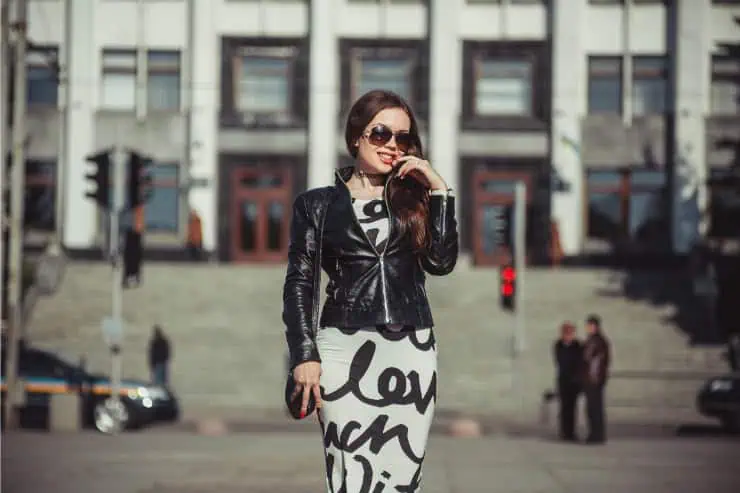
Black and white is a timeless pairing, but when styled too harshly or in outdated silhouettes, it can feel rigid and aging. Think stiff jackets, stark contrast prints, or overly formal styling. The trick now is softening the contrast, pairing cream with charcoal or mixing in soft patterns like florals or abstract prints. Flowy fabrics or relaxed cuts also help tone down the severity. A little warmth in the tones or textures can make this high-contrast pairing more modern and approachable.
6. Red and Black (Too High-Contrast)
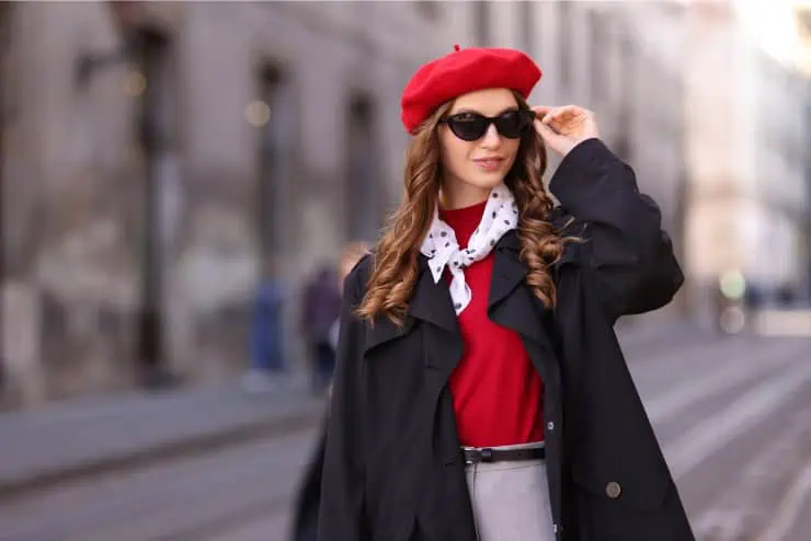
The red-and-black pairing can come off as overly bold or dated if not styled carefully. It often evokes a dated holiday party look or an outdated office outfit. When the red is bright and the black is stark, the look feels harsh and heavy. Stylists now suggest softening red to deeper, more nuanced shades like burgundy or rust and pairing them with softer blacks or charcoals. Adding a third color like blush, ivory, or metallics helps modernize the palette.
7. Pastels on Pastels (With No Grounding Hue)
Wearing pastels head-to-toe was once a springtime favorite, but without a grounding color, this look can feel overly saccharine and juvenile, or simply dated. Pairing baby pink with mint or lilac without structure or contrast flattens the overall outfit. Stylists now recommend combining pastels with neutrals like cream, beige, or even navy to give the look dimension. Alternatively, mix in a deeper accent, like chocolate brown shoes or a camel belt, to anchor the softness.
8. Teal and Purple (90s Overload)
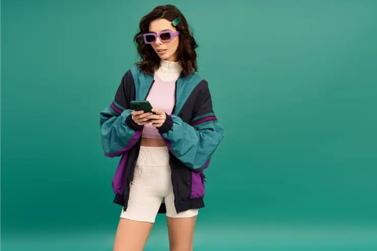
This once-popular combo screams the 1990s in all the wrong ways when styled together without restraint. Teal and purple often clash in vibrancy and can look cartoonish or costume-like. While both colors are still stylish on their own, today’s stylists recommend grounding them with earth tones or pairing them with softer, complementary hues. Teal looks chic with rust, olive, or cream, while purple pairs well with navy or rose.
9. Brown and Pink (Too Retro Without Modern Shapes)

The brown-and-pink combo can feel delightfully retro, or just outdated depending on how it’s styled. In vintage forms, it often leans overly sweet or kitschy, especially in outdated fabrics or prints. Stylists now favor modern interpretations: soft blush pink with espresso brown in tailored pieces, or dusty rose with chocolate in monochrome layering. Texture and silhouette matter here, skip the overly girlish elements and choose sharp cuts or sleek accessories.
10. Burgundy and Forest Green (Holiday Traps)
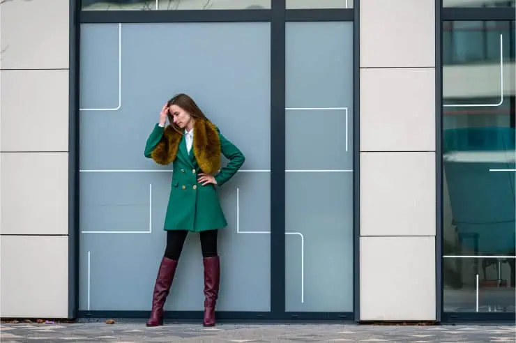
Burgundy and forest green immediately evoke holiday decor when worn together, often dating an outfit to a seasonal cliché. This pairing can feel heavy and overly themed if styled without care. Stylists now encourage separating these rich tones or pairing them with neutrals or updated accents like bronze, camel, or even light denim. Burgundy pops beautifully with blush or ivory, while forest green looks fresh with tan or grey. If you love both, use one for accessories and the other as your base.
11. Yellow and Black (Too High-Contrast)
Yellow and black often draw comparisons to bees or caution signs, not exactly the fashion message most aim for. The high contrast makes it tricky to wear gracefully. Instead of bright yellow with deep black, stylists suggest pairing mustard with navy or marigold with warm greys. You can also pair pale yellow with soft taupe or cream for a more wearable, elegant version.
12. White and Primary Colors (Too Stark and Childlike)
Pairing crisp white with primary blue, red, or yellow can feel stark and overly youthful, like a school uniform or a flag. These color blocks tend to look dated, especially when used in geometric patterns or boxy shapes. To make them feel more modern, stylists suggest toning down the palette. Try off-white with softer variations like rust, periwinkle, or buttercream. You can also use warm whites and textured fabrics to make the outfit feel more grown-up.