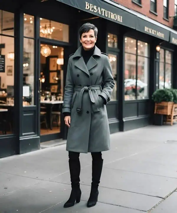
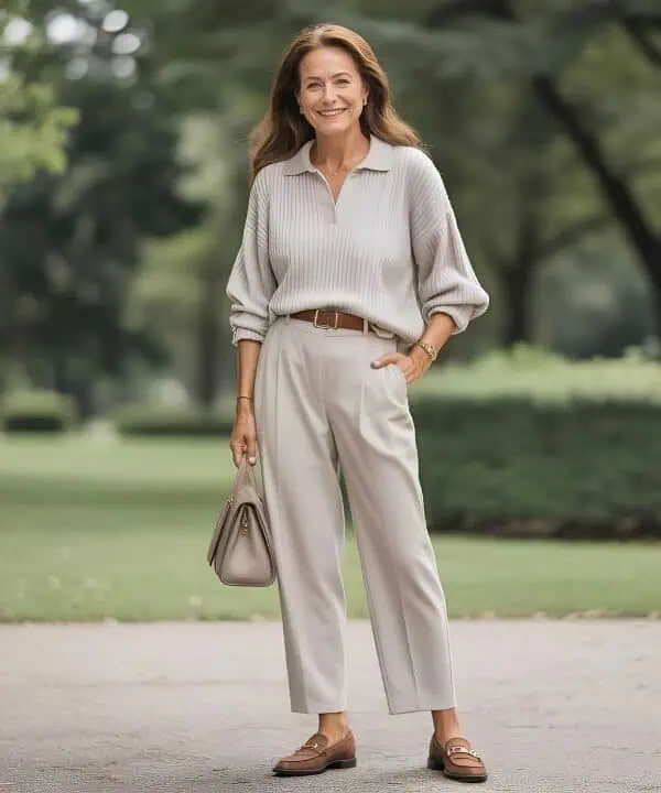
Color is one of the most powerful styling tools. The right shades can illuminate your skin, brighten your eyes, and make your outfit look intentional. But over 50, certain color pairings can feel harsh, outdated, or even unflattering to mature skin tones. That doesn’t mean you need to avoid bold choices it simply means being more thoughtful about how colors interact. Some duos that once worked in your 30s or 40s may no longer deliver the same effect today. Here are 10 color pairings I often recommend my clients rethink after 50, along with easy swaps that feel fresh and timeless.
Table of Contents
1. Black and Yellow

While black and yellow can be striking, the combination often feels too harsh and can even read “costume-like” after 50. Black emphasizes shadows in the face, while yellow can draw out sallowness, especially if your skin has warm undertones. The result may feel more jarring than chic. Instead, try soft gold paired with cream or camel still warm, but far more flattering. Another option is mustard with navy, which gives depth without overwhelming. These softer alternatives keep the richness of yellow tones while avoiding the severity of pairing them with stark black.
2. Navy and Brown

Navy and brown can sometimes feel dull when worn together. While both are classic neutrals, they don’t always complement one another, especially if the tones are too close in depth. The pairing can flatten an outfit rather than elevate it. Instead, break them up with a brighter accent like cream, camel, or even burgundy. For example, a navy blazer with cream trousers and brown boots feels far more intentional than navy and brown alone. It’s not that these colors should never meet, but without a contrasting third tone, the pairing can look heavy and uninspired.
3. Red and Green

Red and green together are instantly associated with holiday dressing, which isn’t always the vibe you want outside December. Over 50, this pairing can feel a little too “theme-like,” taking away from a sophisticated look. Instead, pair red with camel, navy, or even charcoal for a modern contrast. Green, particularly emerald or olive, looks chic with ivory, plum, or metallics. Separating these strong shades and mixing them with more grounding tones ensures your outfit feels intentional rather than seasonal. The key is to wear these colors, but rarely in direct opposition unless you’re truly aiming for festive.
4. Black and Orange

Black and orange together can feel Halloween-inspired, which limits their versatility. While both colors can be striking, the combination reads more novelty than fashion-forward. For women over 50, who often look best in refined and elevated palettes, this pairing can feel too stark. Instead, consider rust or terracotta paired with ivory or deep brown, which maintains autumnal warmth without looking costume like. Likewise, orange looks unexpectedly chic with navy, while black pairs beautifully with softer shades like camel or blush. Separating these colors allows each to shine without conjuring seasonal associations.
5. Grey and Khaki

Grey and khaki often clash because both can lean muted and muddy, resulting in an outfit that lacks vibrancy. Over 50, muted pairings can unintentionally drain color from the face, making you look tired. A better alternative is to balance either shade with crisp white or rich jewel tones. For example, grey and burgundy is a timeless pairing, while khaki looks elevated with navy or cream. If you want to wear both, add a pop of color like teal or coral to bring life back to the look. Contrast is what keeps neutrals looking fresh and chic.
6. Purple and Yellow

While complementary on the color wheel, purple and yellow together often feel jarring and hard to wear, especially in bold tones. After 50, the clash can look less fashion-forward and more cartoonish. Instead, choose softer versions of these shades. Lavender paired with grey or soft camel feels modern and chic, while mustard pairs beautifully with navy or cream. If you love purple, pair it with jewel tones like emerald or deep burgundy for richness. The goal is harmony subtle blends of tones that enhance your features rather than creating stark, high-contrast clashes.
7. Pink and Red

Pink and red is a trendy pairing, but it can be tricky over 50 because it often feels forced. The bold clash works in high-fashion editorials but doesn’t always translate into everyday sophistication. Instead, opt for softer combinations like blush with burgundy or rose with camel. These pairings keep the warmth and romance of pink tones but ground them with depth. If you love mixing these two, choose shades that are closer in saturation, like raspberry and fuchsia, which blend more seamlessly. The key is avoiding combinations that feel too loud or intentional without balance.
8. White and Cream
Monochrome dressing can be elegant, but pairing stark white with cream can sometimes look accidental rather than purposeful. The slight mismatch of tones may make one shade appear dingy against the other. Instead, choose tonal pairings intentionally like cream with beige or white with soft grey. These combinations create cohesion without the jarring effect of mixing undertones. Another chic approach is layering different textures in the same color family (like ivory knit with cream wool), which feels deliberate. Over 50, tonal dressing looks best when the pairing is cohesive rather than “almost matching.”
9. Black and Brown

Black and brown has been controversial for years, and while it can work in certain contexts, it often feels mismatched if not styled with intention. For women over 50, this pairing can appear heavy, especially in flat fabrics like wool or cotton. To make it work, you need contrast like adding cream, gold, or camel to break up the two dark tones. Otherwise, the look risks feeling muddled. If you love brown, pair it with navy or olive. If you love black, elevate it with jewel tones. Intentionality is what separates chic combinations from accidental clashes.
10. Pastels with Neons

One of the least flattering pairings for women over 50 is pastels with neons. The softness of pastels clashes with the intensity of neons, and together they rarely flatter mature skin tones. Instead of looking modern, the pairing feels unbalanced and dated. A better option is pairing pastels with other soft shades, like lavender with pale grey, or pairing neons with grounding neutrals, like hot pink with black. Both color families can be worn, but rarely together. Keeping palettes cohesive in tone either all soft or all bold creates a polished and intentional look.